App Features That Real Users Actually Care About
Have you ever downloaded an app that promised the world but left you scratching your head at first launch? We’ve all been there. At CogentDevs, we believe the best features are the ones users hardly notice—because they simply fit into daily life. In this post, I’d like to share some real-world app features that people genuinely appreciate, based on what we’ve learned talking to clients, watching analytics, and yes, sometimes hearing colorful feedback when things go sideways.
A Friendly Welcome: Onboarding That Feels Like a Handshake
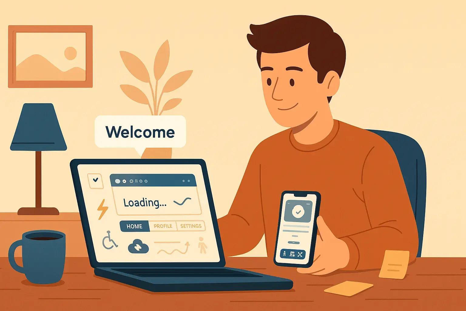
Think back to a time you installed something new and then stared at a blank screen wondering what to do next. That awkward pause is exactly what we want to avoid. In human terms, onboarding should feel like a warm greeting, not a pop quiz.
When we roll out a new app at CogentDevs, we often begin with a simple question: “If I were using this first time, what would I need to see?” Sometimes it’s as small as a “skip tutorial” button—because not everyone wants to be held by the hand, but those who do should feel guided, not lectured. And for those who skip, sprinkling subtle hints later—like a gentle tooltip pointing out a hidden gem—can avoid overwhelming people up front.
Speed Matters: Nobody Likes to Wait
Picture tapping an icon and staring at a spinning wheel for ages. It feels like a test of patience you didn’t sign up for. We try to remember that each delay chips away at goodwill. In practice, this often means investing effort early: compressing images, caching data smartly, and showing reassuring feedback (a tiny animation or message) so users know the app heard them.
I recall a project where the initial load felt sluggish on older phones. Once we optimized a few calls and lazy-loaded non-essential content, the improvement was night and day. Users went from grumbling to complimenting the swiftness, and that made us realize how much small tweaks matter.
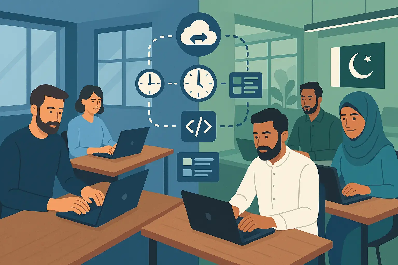
Navigation That Feels Like Home
When someone picks up a new tool, they shouldn’t need a map and compass to find basic functions. We like to lean on familiar patterns—tabs at the bottom on mobile, a sidebar on web—but we don’t treat these as gospel. Instead, we watch people interact: if clients repeatedly click “Profile” when they want “Settings,” maybe labels need tweaking.
We’ve sat in usability sessions where a user mutters, “I thought XYZ would be there,” highlighting assumptions we didn’t catch in planning. Those sessions are gold. If you can’t run formal testing, even a quick hallway chat with a colleague using the prototype can reveal hidden expectations.
Making It Yours: Subtle Personalization
People appreciate when an app seems to “get” them without feeling stalked. For example, reordering shortcuts based on what someone uses most often, or remembering preferred theme (light vs. dark). But there’s a balance: you don’t want to surprise users with something they don’t understand. So we build simple settings screens, letting people tweak what matters—notifications, display options, or how often they hear from us.
On one project, we tried a recommendation feature: suggesting content based on past behavior. At first, recommendations felt off because we hadn’t collected enough data. Instead of persisting with bad suggestions, we pulled back, explained that smarter recommendations need time, and invited users to opt in. That honesty built trust.
Notifications: Helpful Reminders, Not Nagging
We’ve all muttered “Why is this pinging me again?” when an app floods notifications. At CogentDevs, we aim for notifications that feel like a timely nudge from a considerate friend: reminding you of a deadline you set, confirming an action you took, or letting you know something changed. Before adding any alert, we ask: “Will the user thank us for this, or resent it?”
Allowing users to set “quiet hours” or choose categories of alerts helps prevent fatigue. And when crafting the message, we keep tone conversational: instead of “Your task is pending,” maybe “Hey, don’t forget your task due tomorrow—ready to wrap it up?” Small language tweaks make a difference.
Offline and Unpredictable Networks
Imagine writing a note mid-tunnel on the train—you shouldn’t lose your progress just because connection hiccuped. We plan for that: caching essential data locally, queuing actions, and syncing once online. Of course, we don’t implement offline for every feature; we pick what matters most (say, drafting messages or viewing recent info) rather than over-engineering rare cases.
Testing under shaky networks—turning Wi-Fi off, throttling speeds—reveals surprises. In one app, we discovered that saving drafts offline caused conflicts when someone edited the same item on another device. Addressing merge conflicts upfront, or alerting users gently when manual intervention is needed, saves frustration later.
Trust Through Security and Transparency
Users need to trust that their data is safe. We don’t cloak privacy policies in legalese; instead, we explain in plain language what data we collect, why, and how users can control it. For authentication, offering options like social login or two-factor feels secure yet familiar.
During development, we regularly update dependencies and check for vulnerabilities. When clients ask, “How do you protect our info?” we can point to encryption practices, regular audits, and a responsive update process. This transparency reassures both users and stakeholders.
Inclusive Design: Everyone Deserves a Good Experience
Building with accessibility in mind isn’t just a checkbox—it means more people can use and enjoy the app. We think about font sizes, color contrast, screen-reader labels, and keyboard navigation early. Sometimes teams postpone accessibility until “later,” but we’ve found that weaving it in from the start avoids costly rework and reflects respect for all users.
Inviting people with different abilities to try prototypes often highlights issues we’d never spot ourselves. It’s humbling but invaluable.
Seamless Integrations
Users often juggle multiple tools. When an app can connect—syncing calendars, exporting reports to familiar formats, or integrating payment gateways—it feels like part of their workflow, not an island. We prioritize integrations based on actual user requests rather than “shiny” tech. If most clients ask for a certain CRM or cloud storage link, that becomes a priority; lesser demands wait.
Handling integration errors gracefully—like token expirations or rate limits—means showing clear guidance (“Reauthenticate here to keep things flowing”) rather than cryptic errors.
Listening and Iterating
The most “wanted” features often emerge from conversations and usage data. We add simple in-app feedback: a “Was this helpful?” prompt or a quick survey asking what’s missing. Combined with analytics (respecting privacy), we see which features shine and which gather dust. Then we decide: improve, pivot, or sunset.
I remember a case where a dashboard feature looked impressive in a demo, but actual users rarely clicked into it. Instead, they craved a quick summary on their home screen. So we trimmed the complex dashboard and surfaced key stats more prominently. Users loved it—and resources shifted to building what truly mattered.
Building for Growth
Early on, a simple setup may suffice. But if you imagine your app growing, modularity helps: writing code so new features plug in without massive rewrites. We often start lean—enough to launch quickly—but keep an eye on structure so as user counts rise, performance, monitoring, and scaling won’t require a full rebuild.
At CogentDevs, we see apps as tools that should feel like helpful companions, not puzzles to solve. The features users actually want are often understated: a warm welcome, swift responses, intuitive paths, respectful notifications, reliable offline support, transparent security, inclusive design, and integrations that ease life. Above all, listening—truly listening—and iterating based on honest feedback makes the difference between an app people tolerate and one they rely on daily.
Next time you brainstorm features, imagine a conversation: “If I were using this after a long day, would this feel natural? Would it solve my problem without extra fuss?” That mindset keeps development human-centered and grounded in reality. And that’s how you build apps that users not only download but also stick with, recommend, and enjoy.